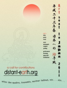

Cranes to Nihon 2011 by 馬鞭 (H.R. Downs)
日本への千羽鶴
地球へと舞い降りようとする鶴の群れが,体を傾けて旋回を始める.その様子を強調する目的で,フラクタル効果の渦巻き曲線を重ねてみた.
地球の地平を表すカーブも,宇宙に浮かんだ「惑星」らしく見えるように,少し大げさに丸くしてある.地上に縛られたままの現世的,人間的観点からすれば,地球という「惑星」がこんな風に見えてほしい,と期待されるようにね.この高度から見下ろした場合,たとえ科学的に見て,どこまでも水平に近い地平線こそが正しいとしてもだ.
当初,日本に千羽鶴の風習があることを聞いた時,自分としては,白い鶴だけで画面を埋めたほうが渋くて格好いいかなと思ったんだ.なぜなら地震でたくさんの人が亡くなった事を思うと,白こそが鎮魂に相応しいと思ったからなんだ.でも,残された人々を応援するために色を付けたほうが善いと,もう一度思い直し,出来上がっていたムーブメントを壊さない程度の中間色で塗ってみた.鶴が螺旋を描いて降下していく感じを壊さずに表現できているかな?
日本のフォントを使って,”One thousand cranes for Japan from MaBian” と書いたつもり.それと西暦の2011年と書く代わりに,日本の天皇の年号「平成23年」を書き添えた.最初にみんなでポスターを作る時に必ずこれは入れよう,そう決めたようにね.これで通じるかな?
A fractal-based swirling curve to emphasize the flock banking into a turn to descend to earth.
Exaggerated the curve of the earth a little rounder. So it reads more like “planet” as might be expected from an earthly point of view. Even though the vast flat horizon may be scientifically accurate at the altitude.
In early plan, I had thought the white cranes might be better because it’s stark, plain. Moreover I was considering the number of people who died, white may be the best color for their requiem. But I finally painted them up with pastel colors for cheering up people. Didn’t I brake the movement of spiraling down with them?
With the Japanese fonts, I want to say: “One thousand cranes for Japan from MaBian.” And I inserted the Emperor’s dateA: “HeiSei 23” from the original poster, instead of 2011. Make sense?
馬鞭 (H.R. Downs)
http://www.mabian.biz/